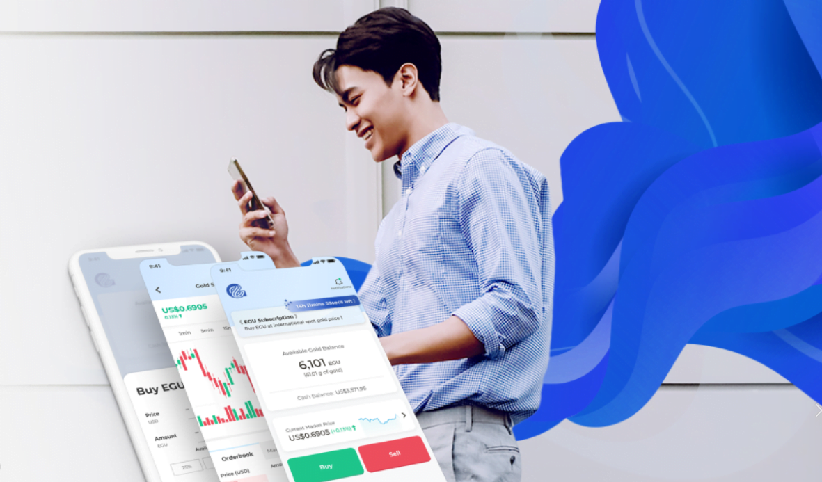
From Complexity to Confidence: Reimagining the Everest Gold Experience

Product
UI/UX

Role

Research
Ideation
Wireframing
UI Design
Prototyping

Overview

Understanding the intimidating nature of trading for new users, this comprehensive redesign reimagined the Everest Gold experience. The primary focus was simplifying the trading interface to empower novice investors, accompanied by a complete overhaul of the app's navigation, onboarding, and brand-aligned visual style. The ultimate goal was to boost trading activity without sacrificing functionality for experienced users.

Introduction to Everest Gold

Everest Gold is an innovative gold trading platform focused on making gold ownership accessible to everyone. Through convenience and affordability, it enables users to buy and sell fractional gold (as little as 0.01g, or ~$0.60) using blockchain technology. 

To enhance the overall user experience, Everest Gold conducted a 3-month international beta test with over 25,000 participants. This data was used to identify areas for improvement and guide a comprehensive redesign.

Challenges to Adoption

Beta user feedback highlighted key friction points within the Everest Gold platform, presenting an opportunity to optimize the experience and empower a broader range of investors.
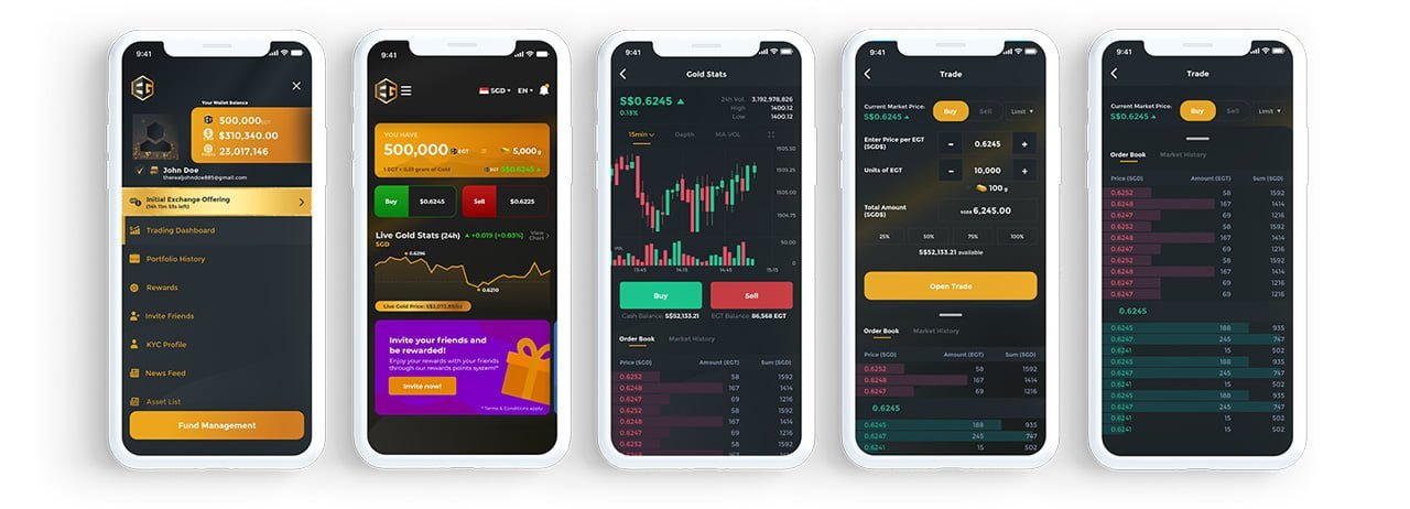
  1. Intimidating Trading Interface: Approximately 23% prospective traders expressed interest but found the interface too complex, preventing them from confidently executing their first trade.
    • Primary: Data overload caused clutter and confusion, especially for inexperienced users struggling to interpret the order book.
    • Secondary: Users were hesitant about buying at 'good prices' due to market uncertainty. This highlights the challenge of providing decision-making support without offering direct financial advice.

  2. Lengthy KYC Process: 37% of users found the signup and KYC process overly cumbersome, leading to drop-off before ever reaching the trading screen.

  3. Confusing Navigation: Navigation was a major pain point, with 13% of users unable to locate essential features due to a hidden menu structure, and 17% struggling to find the 'Fund Management' button. This lack of clear hierarchy created significant frustration.

  4. Unwelcoming Visual Style & Brand Alignment: Feedback indicated the original app design felt intimidating and complex. It was also misaligned with the approachable brand image Everest Gold sought to convey. This required a redesign prioritizing clarity and a user-friendly aesthetic.


Problem Statement

“How might we empower users to feel comfortable and confident when trading on the Everest Gold app, despite the inherent complexity of the market?”

Goals

Business Goals

  • Increase in sign ups and KYC conversions.
  • Increase in trading activity.

User Goals

  • Lowest friction path to begin their trading journey.
  • Easily and conveniently buy and sell gold in the fast paced digital age.

Impact on User Adoption & Engagement

The redesigned interface's emphasis on empowering novice users translated into rapid growth and engagement.  Within 6 months of launch, key metrics included:

  • Over 100,000 downloads
  • Over 68,000 KYCs completed
  • Over 52,000 active traders (MAU)
  • $600,000,000 in trading volume

While industry benchmarks for the gold trading niche are limited, these figures demonstrate significant market penetration and user engagement. This rapid growth highlights the redesigned interface's effectiveness in reducing barriers for first-time precious metals investors.

Process

This redesign took place in the midst of the COVID-19 pandemic, a period of rapidly shifting business models and market uncertainty.  To ensure alignment, timely decision-making, and clarity for the development team, I proactively mapped user flows and created detailed screen designs for various scenarios. This approach was crucial in navigating indecision, misaligned expectations,  and constantly changing priorities.  Despite these challenges, we successfully delivered the project within the given timeframe.

This redesign took place in the midst of the COVID-19 pandemic, a period of rapidly shifting business models and market uncertainty.  To ensure alignment, timely decision-making, and clarity for the development team, I proactively mapped user flows and created detailed screen designs for various scenarios. This approach was crucial in navigating indecision, misaligned expectations,  and constantly changing priorities.  Despite these challenges, we successfully delivered the project within the given timeframe.

Early Designs

To address the identified user experience challenges, I established three guiding principles for my redesign:

  • Clarity of information: Prioritizing essential data and simplifying its presentation.
  • Familiarity of interface: Leveraging common UI patterns to reduce the learning curve.
  • Comfort of environment: Creating a visually uncluttered space to promote focus.


Throughout this process, I was mindful of key constraints, including:
  • User Range: Balancing the needs of both inexperienced users desiring simplicity and experienced traders seeking more advanced data.
  • Functionality vs. Clarity: Finding the right balance between essential features and a clean, intuitive interface."
  • Legal Restrictions: Ensuring all designs adhered to regulations by avoiding elements interpretable as direct financial advice.

Trading Interface Design Exploration

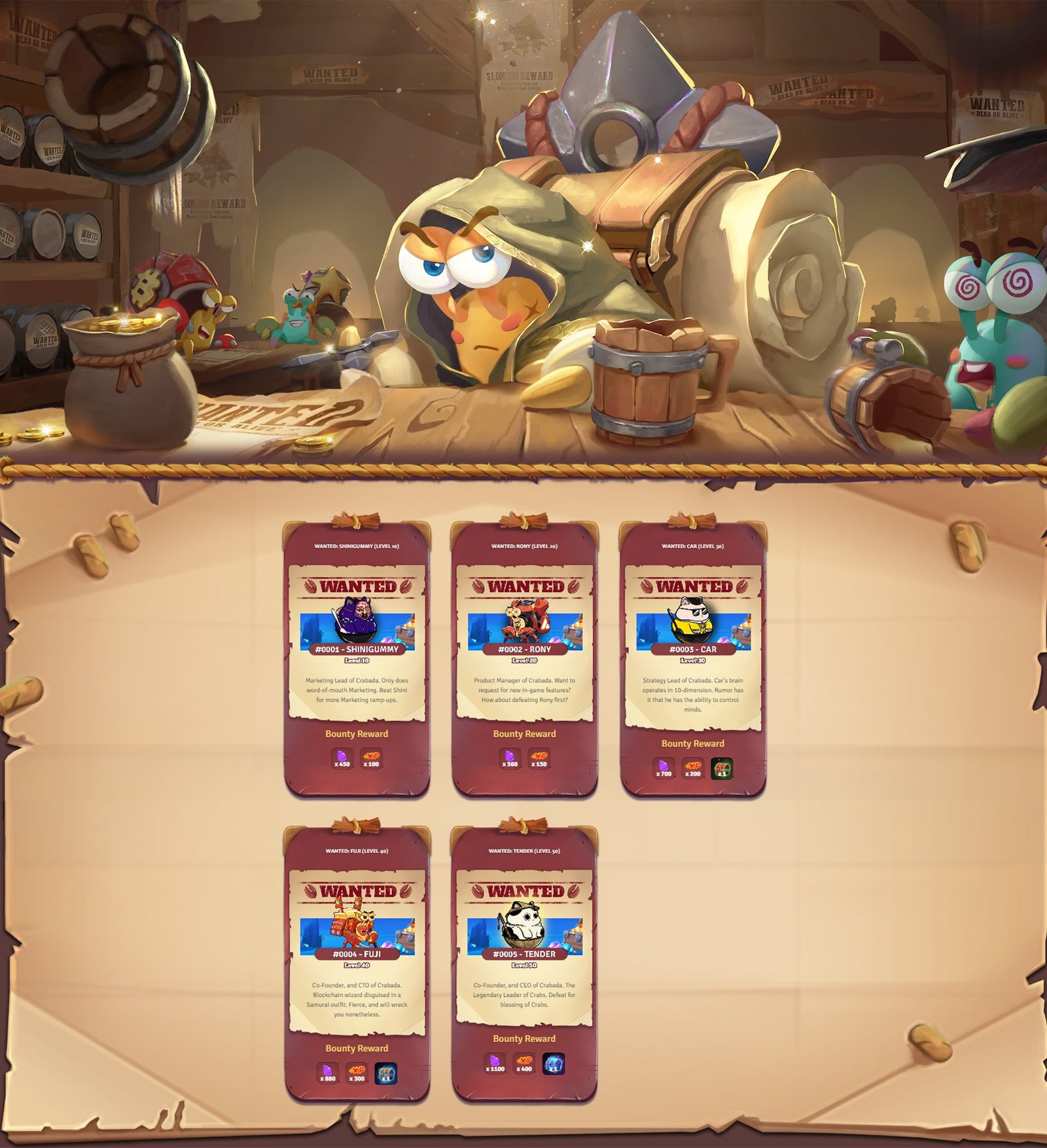
The Battle Bounty MVP, with its pilot "Battle to the Dev(s)" event, was received enthusiastically:

  • Increased Engagement: Over 17,000 battles in one week with a DAU recovery of ~36%.
  • High Retention: ~68% daily return rate during the event period.
  • Proven Potential: The Battle Bounty system demonstrated clear capacity to attract, retain, and re-engage players while showcasing the potential for integrated partnerships.

The Battle Bounty Vision: A Foundation for Growth

Despite Crabada’s sunset due to external funding constraints, Battle Bounty held significant potential for sustainable growth and engagement, which was proven by the MVP results.

The Battle Bounty system's MVP, despite its quick development, was designed to lay the foundation for significant expansion, aiming to become a cornerstone of Crabada's growth, with a clear vision for its evolution:
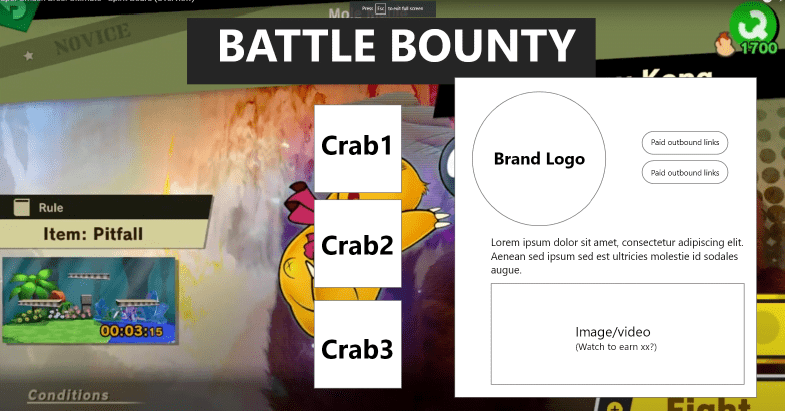
  • Strategic Partnerships to Drive Excitement & Revenue

Time-limited bounties featuring prominent crypto figures and projects would establish a compelling proof of concept, paving the way for partnerships with diverse brands across crypto and beyond. 

These partnerships open the door to:
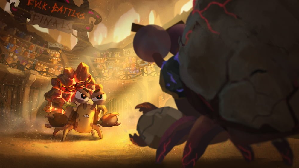
    • Cross-Promotion: Attracting new players from partners' communities.
    • Unique Experiences: Bounties designed in collaboration with partners, creating exclusive in-game moments.
    • Sustainable Revenue: Establishing the Bounty Board as a premium, integrated advertising platform.
  • Lore Integration, Evolving World, & Rewards

The goal was to go beyond rewarding gameplay; I aimed to deepen immersion in Crabada's world. The Bounty Board would become a tool for dynamic storytelling:
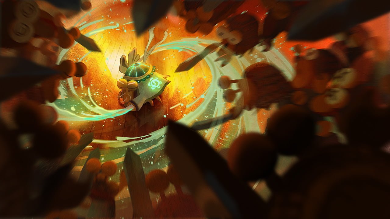
    • Narrative Battles: Bounties centred on lore figures, pivotal events, and player-driven conflicts.
    • World Building at Scale: Large-scale community challenges and world boss raids would allow players to trigger in-game events that directly shape Crabada's evolution.
    • Exclusive Items: Unique items, cosmetics, and titles obtainable only through bounties.
  • In-App Integration
    The Bounty Board's initial web-based form was functional but limited. Transforming it into an immersive in-app feature would elevate the experience, solidifying its position within Crabada. This integration would:

    • Streamline Gameplay: Enhance player flow and convenience.
    • Brand Advertising Space: Create a dedicated space with brand-aligned visuals, further attracting sponsors.

What I Learnt

The Importance of Agility: The urgent need to revitalise Crabada highlighted the importance of being able to pivot our approach rapidly. Repurposing existing assets and finding inspiration in unexpected places allowed us to deliver a successful MVP under tight time constraints.

The Power of Play: The Bounty Board validated the importance of designing for replayability. Its fast-paced, "one more time" appeal demonstrated the power of a compelling gameplay loop in fueling player excitement and retention.

Partnership-Oriented Design: From the outset, the Bounty Board was envisioned as a platform for collaboration and revenue generation. By prioritising features that create intrinsic value for players, sponsorship opportunities organically emerge, allowing for sustainable growth that benefits both players and the game's long-term health.

Market Realities & Resource Management: The Battle Bounty project underlined the importance of aligning ambitious development visions with market realities and financial sustainability. This experience taught me how to plan for potential roadblocks and creatively adapt iterative design strategies when resources are limited.

Let's Connect

Thank you for taking the time to explore this case study. I hope you enjoyed seeing my thought process and ideas! If you're seeking someone passionate about driving engagement through innovative product and marketing solutions, let's explore how we can build exciting experiences together!